Selected

Projects
Selected
Projects
1. Typographic Journal
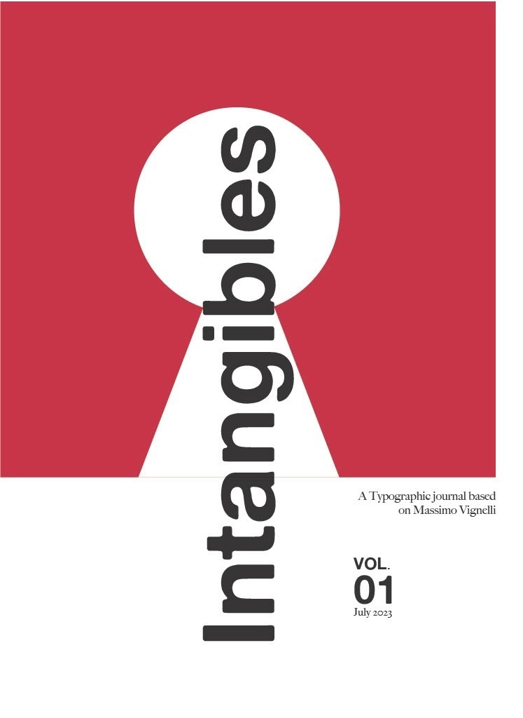
Intangibles
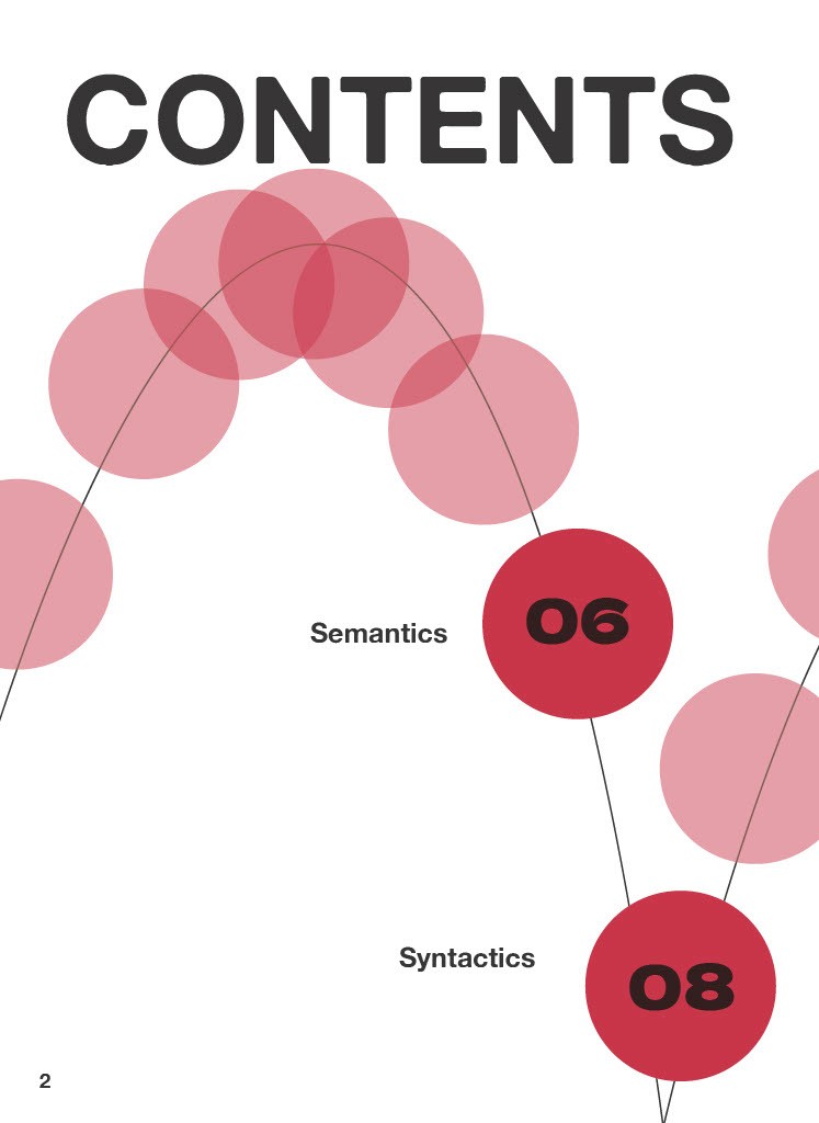
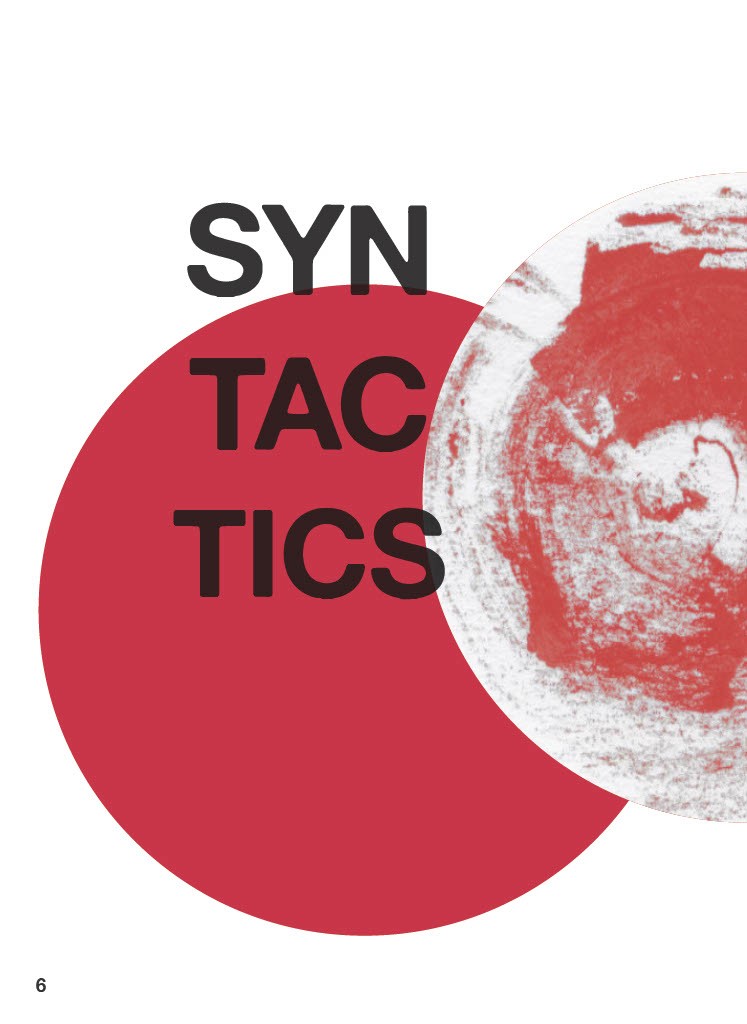
This typographic journal was based on Massimo Vignelli’s, a manual for understanding design. The work draws on Vignelli’s key intangible ideas for good design being “semantically correct, syntactically consistent, and pragmatically understandable”. The bold, authoritative voice and nature of the book inspired the monochromatic use of a single blood red to capture these principles of visually forceful design. A sharp repetition of line, shape and text across the work point towards the simplicity in geometric shapes as a timeless rule of design.
2. Visual Brand Identity
Rhythm
In developing a hypothetical visual brand identity for the annual AGDA Awards Exhibition, the theme “Design is Rhythm” is a celebration of the dynamic culture and rhythm of the Australian design community. Bouncing lines and rippling pools inject an air of playfulness and curiosity in commemorating a community of designers and creators who come from diverse practices of the design. The spirited liveliness of these visual guidelines is captured in the wordmark logo ‘rhythm’ which interprets this connection in exaggerating the varying height of each letter to create its own jumping beat.

3. UX/UI
Xplor Eora
Eora is the original name given to Sydney by the indigenous peoples and traditional custodians of the land. Xplor Eora is an mobile experience design for travellers and Sydney-siders looking for self-guided tours with more than just the latest tourist attraction. This project takes user’s behaviours into the design of the app, along with the social and cultural significance of these sites in order to create a user-centric design.
Selected
Projects
1. Typographic Journal
Intangibles
This typographic journal was based on Massimo Vignelli’s, a manual for understanding design. The work draws on Vignelli’s key intangible ideas for good design being “semantically correct, syntactically consistent, and pragmatically understandable”. The bold, authoritative voice and nature of the book inspired the monochromatic use of a single blood red to capture these principles of visually forceful design. A sharp repetition of line, shape and text across the work point towards the simplicity in geometric shapes as a timeless rule of design.
2. Visual Brand Identity
Rhythm
In developing a hypothetical visual brand identity for the annual AGDA Awards Exhibition, the theme “Design is Rhythm” is a celebration of the dynamic culture and rhythm of the Australian design community. Bouncing lines and rippling pools inject an air of playfulness and curiosity in commemorating a community of designers and creators who come from diverse practices of the design. The spirited liveliness of these visual guidelines is captured in the wordmark logo ‘rhythm’ which interprets this connection in exaggerating the varying height of each letter to create its own jumping beat.
3. UX/UI
Xplor Eora
Eora is the original name given to Sydney by the indigenous peoples and traditional custodians of the land. Xplor Eora is an mobile experience design for travellers and Sydney-siders looking for self-guided tours with more than just the latest tourist attraction. This project takes user’s behaviours into the design of the app, along with the social and cultural significance of these sites in order to create a user-centric design.